

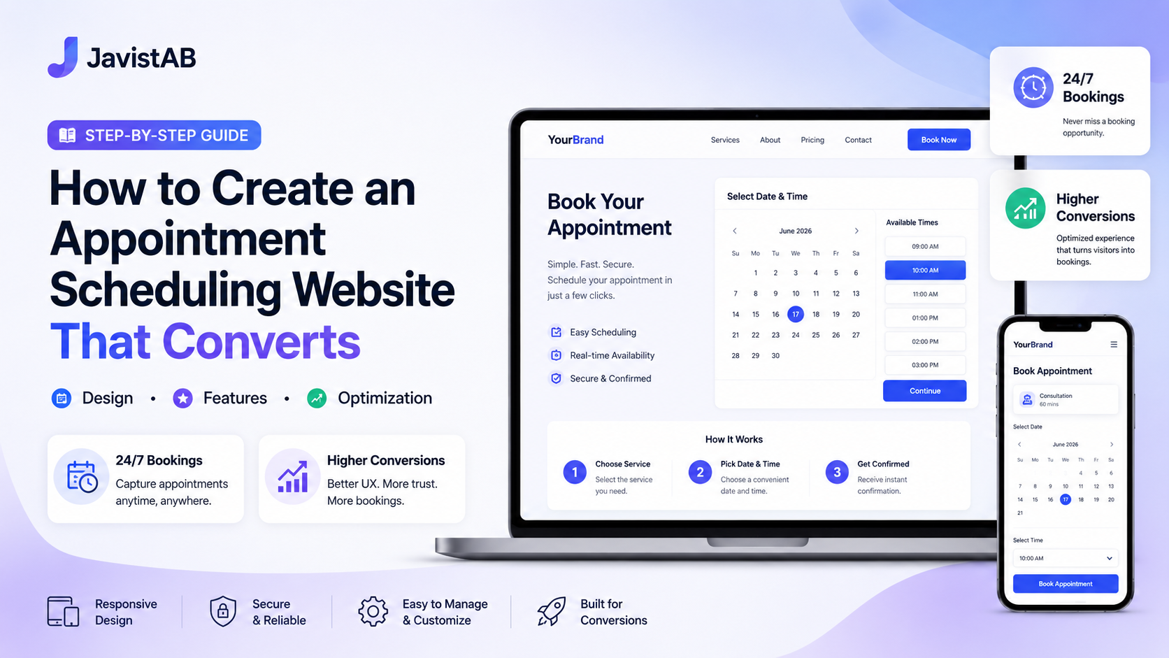
Your website should be your hardest-working employee—booking appointments around the clock without breaks, sick days, or overtime. Yet most service business websites fail at this basic function, forcing visitors to call, email, or navigate confusing booking processes.
Building an effective appointment scheduling website isn’t just about adding a booking form. It’s about creating an experience that guides visitors from landing to confirmed booking with minimal friction. This guide shows you exactly how to build that experience.
What You’ll Learn:
- Essential elements every scheduling website needs
- Design principles that increase booking conversions
- Step-by-step implementation process
- Optimization strategies for ongoing improvement
- Common mistakes that kill conversions
What Makes a Scheduling Website Effective
Before diving into specifics, let’s understand what separates high-converting scheduling websites from those that lose visitors.
The Visitor’s Journey
Every visitor arrives with a problem they want solved. For service businesses, that journey typically follows this path:
- Awareness: “I need [service type]” → Search or referral
- Consideration: “Is this the right provider?” → Evaluate your site
- Decision: “Can I book easily?” → Find and use booking
- Action: “Done!” → Complete booking
Your website must guide visitors through each stage seamlessly. Any friction—confusing navigation, unclear pricing, hidden booking options, complicated forms—causes drop-off.
Key Performance Indicators
Effective scheduling websites excel at these metrics:
| Metric | Poor | Average | Excellent |
|---|---|---|---|
| Booking page conversion rate | <10% | 15-25% | 30%+ |
| Form abandonment rate | >75% | 60-75% | <50% |
| Mobile booking rate | <30% | 40-50% | 55%+ |
| Time to book (from landing) | >5 minutes | 2-4 minutes | <2 minutes |
The Core Principle: Reduce Friction
Every additional click, field, or decision point reduces conversions. The best scheduling websites remove obstacles ruthlessly while providing just enough information for confident booking.
Think of your website as a funnel—wide at the top (homepage visitors), narrowing at each stage (service interest, booking intent), and ending with converted bookings. Your job is to minimize leakage at each stage.
Essential Pages and Elements
A scheduling website needs specific pages working together. Here’s what each should accomplish.
Homepage
Your homepage has one job: get visitors to the next step in their journey.
Essential elements:
- Clear value proposition: What do you do and for whom? (Above the fold)
- Primary CTA: “Book Now” button, prominent and unmissable
- Trust signals: Reviews, ratings, credentials, client logos
- Service overview: Brief introduction to your offerings
- Social proof: Testimonials, case studies, or statistics
Example hero section structure:
Headline: “Expert Massage Therapy in Downtown Seattle”
Subheadline: “Release tension, reduce pain, and feel your best with personalized therapeutic massage”
Primary CTA: [Book Your Session] button
Secondary CTA: “View Services” link
Trust badges: “4.9★ on Google | 500+ Happy Clients | Licensed Since 2015”
Services Page
This page helps visitors understand what you offer and choose the right service.
Essential elements:
- Service categories: Organized logically for easy scanning
- Service descriptions: Benefits-focused, not just features
- Duration and pricing: Transparent information builds trust
- Individual booking buttons: Each service should link directly to booking that specific service
- Comparison tools: Help visitors choose between similar services
Booking Page
The critical conversion point. This page should be laser-focused on completing the booking.
Essential elements:
- Booking widget/form: Prominent and functional
- Service selection: If not pre-selected from services page
- Staff selection: If applicable to your business
- Calendar/availability: Clear, easy to navigate
- Contact form fields: Minimal—name, email, phone
- Payment integration: If taking payments/deposits
What to remove:
- Distracting navigation elements
- Sidebar content
- Unnecessary form fields
- Exit links before booking completes
About Page
Builds credibility and personal connection—important for service businesses where trust matters.
Essential elements:
- Your story: Why you do what you do
- Credentials: Training, certifications, experience
- Team photos: Real photos, not stock images
- Values: What clients can expect from working with you
- Booking CTA: Don’t forget—this page should also drive bookings
Contact Page
For visitors who have questions before booking.
Essential elements:
- Booking link: Primary CTA—direct to scheduling
- Phone number: For those who prefer calling
- Email: For detailed questions
- Location/address: With map if applicable
- Hours: When you’re available
- Contact form: For non-booking inquiries
Designing the Perfect Booking Flow
The booking flow—the sequence of steps from clicking “Book” to confirmed appointment—is where conversions are won or lost.
The Ideal Booking Flow
- Service selection (if not pre-selected): 1 click
- Staff selection (if applicable): 1 click
- Date selection: 1-2 clicks
- Time selection: 1 click
- Contact information: 3-4 fields
- Payment (if applicable): Standard payment form
- Confirmation: Instant feedback
Total: 5-7 steps, under 2 minutes to complete.
Booking Flow Best Practices
Progress Indication
Show users where they are in the process. A simple progress bar (“Step 2 of 4”) reduces anxiety and abandonment.
Smart Defaults
Pre-select sensible options where possible:
- Default to the next available date, not a blank calendar
- If user came from a service page, pre-select that service
- For returning customers, pre-fill known information
Inline Validation
Validate form fields as users complete them, not after submission. Instant feedback on email format, required fields, etc. prevents frustrating error screens.
Mobile-First Design
Design the booking flow for mobile first, then adapt for desktop. Over 60% of bookings happen on mobile—if your flow isn’t thumb-friendly, you’re losing majority of potential bookings.
Clear Error Messages
When something goes wrong, tell users exactly what and how to fix it:
- Bad: “Invalid input”
- Good: “Please enter a valid email address (example@domain.com)”
Calendar Interface Guidelines
The calendar is often the biggest friction point. Design it for clarity:
- Show availability clearly: Available dates should stand out visually
- Disable unavailable dates: Don’t let users select dates with no availability
- Allow easy navigation: Easy to move between weeks/months
- Show time zone: Critical for businesses serving multiple regions
- Limit choices: Show 1-2 weeks at a time, not overwhelming month views
Form Field Optimization
Every field you add reduces completion rates. Ruthlessly question each one:
| Field | Keep? | Why |
|---|---|---|
| Name | ✅ Yes | Essential for personalization |
| ✅ Yes | Required for confirmation | |
| Phone | ✅ Usually | Needed for reminders/emergency contact |
| Address | ❌ Usually no | Unless service requires it (mobile services) |
| Date of Birth | ❌ No | Collect after booking if needed |
| How did you find us? | ❌ No | Ask in follow-up, not during booking |
| Notes/Comments | ⚠️ Optional | Make it optional, not required |
Technical Setup Guide
Let’s get practical. Here’s how to implement your scheduling website on WordPress.
Step 1: Choose Your Foundation
You need three components:
- WordPress hosting: Reliable host with good performance (SiteGround, Cloudways, or similar)
- WordPress theme: Clean, fast theme compatible with booking plugins (Astra, GeneratePress, Kadence)
- Booking plugin: Feature-complete solution like JavistAB
Step 2: Install and Configure Booking Plugin
Follow our complete booking system installation guide for detailed steps. Key configuration priorities:
- Set timezone correctly
- Configure all services with accurate durations
- Set availability and working hours
- Enable payment processing
- Set up automated notifications
Step 3: Create Booking Page
Create a dedicated booking page with these characteristics:
- URL: example.com/book or example.com/schedule (short, memorable)
- Template: Use a full-width template with no sidebar
- Content: Minimal—the booking widget should dominate
- Navigation: Consider hiding or minimizing main navigation
Step 4: Add Booking CTAs Everywhere
Every page should include booking calls-to-action:
- Header: “Book Now” button in main navigation
- Homepage: Multiple CTAs (hero, mid-page, footer)
- Service pages: Book button after each service description
- About page: CTA in sidebar or end of content
- Blog posts: Contextual CTAs within relevant content
- Footer: Booking link in every footer
Step 5: Set Up Confirmation Flow
After booking, users should receive:
- Instant on-screen confirmation: Thank you page with appointment details
- Email confirmation: Within 1 minute of booking
- Calendar invite: Downloadable or direct-to-calendar
Step 6: Test Everything
Complete multiple test bookings covering:
- Different services
- Different devices (desktop, mobile, tablet)
- Different browsers
- Payment processing (use test mode)
- Email delivery
- Calendar sync
Mobile Optimization Essentials
With 60%+ of bookings happening on mobile, this isn’t optional—it’s essential.
Mobile Booking Interface Requirements
- Touch-friendly buttons: Minimum 44×44 pixels tap targets
- Single-column layout: No side-by-side elements on small screens
- Large, clear calendar: Easy date selection with fingers
- Appropriate keyboard types: Number pad for phone, email keyboard for email
- Minimal scrolling: Key actions visible without scrolling
Mobile Performance
Mobile users are often on slower connections. Ensure:
- Fast page load: Under 3 seconds on 3G
- Optimized images: Compressed and properly sized
- Minimal scripts: Only essential JavaScript
- Lazy loading: Load below-fold content as needed
Mobile Testing
Test on actual devices, not just browser emulation:
- iPhone (various models)
- Android phones (various manufacturers)
- Different screen sizes
- Different connection speeds
Building Trust That Converts
Service businesses require trust—clients are often coming to your physical location or sharing personal information. Your website must establish credibility.
Essential Trust Elements
Reviews and Testimonials
Display reviews prominently throughout your site:
- Google Reviews integration
- Written testimonials with client photos and names
- Video testimonials (especially powerful)
- Review count and average rating displayed prominently
Credentials and Certifications
Display relevant professional credentials:
- Licenses and certifications
- Professional association memberships
- Training and education
- Years of experience
Transparent Policies
Clear policies reduce booking hesitation:
- Cancellation policy (prominently displayed)
- Refund policy
- Privacy policy
- What to expect during appointments
Security Indicators
For payment-enabled booking:
- SSL certificate (https)
- Payment security badges
- Known payment processor logos (Stripe, PayPal)
Social Proof Placement
Strategic placement increases impact:
- Near booking buttons: Testimonial or review snippet next to CTAs
- On booking page: Reassurance at the conversion point
- Service pages: Relevant testimonials for each service
- Homepage: Overall rating and review highlights
Conversion Optimization Tactics
Once your foundation is solid, these tactics can significantly improve conversion rates.
Urgency and Scarcity (Used Ethically)
Genuine urgency motivates action:
- Limited availability: “Only 3 slots left this week”
- Popular times: “This time slot usually fills quickly”
- Booking activity: “12 appointments booked today”
Important: Never fake scarcity. Only display true availability data.
Exit Intent and Abandonment Recovery
When users show signs of leaving:
- Exit intent popup: “Don’t forget to book! Questions? Chat with us.”
- Abandoned booking emails: If email captured, send reminder to complete
- Retargeting ads: Show booking reminders to site visitors
Live Chat Support
Real-time assistance can save hesitant visitors:
- Answer questions before they leave
- Guide confused users through booking
- Provide personalized recommendations
Incentives for First-Time Bookers
Reduce the barrier for new clients:
- New client discount: “15% off your first appointment”
- Consultation offer: “Free 15-minute consultation”
- Guarantee: “Satisfaction guaranteed or your money back”
A/B Testing
Continuously test to improve:
- CTA button text and color
- Booking page headline
- Form field order and labels
- Trust element placement
- Pricing display format
Common Mistakes to Avoid
These errors consistently kill scheduling website conversions.
Hidden Booking Options
The mistake: Booking buried in navigation, requiring multiple clicks to find.
The fix: Prominent “Book Now” button in header, visible on every page.
Forcing Account Creation
The mistake: Requiring registration before booking.
The fix: Allow guest booking; offer account creation after booking (optional).
Unclear Pricing
The mistake: Hiding prices until booking or consultation.
The fix: Display prices clearly on service pages. Transparency builds trust.
Too Many Form Fields
The mistake: Asking for excessive information during booking.
The fix: Collect minimum information needed; gather additional details later.
Slow Page Speed
The mistake: Heavy pages that take 5+ seconds to load.
The fix: Optimize images, minimize plugins, use caching, quality hosting.
No Mobile Optimization
The mistake: Desktop-focused design that’s unusable on phones.
The fix: Mobile-first design, thorough mobile testing.
Broken Booking System
The mistake: Technical issues that prevent completing bookings.
The fix: Regular testing, monitoring for errors, immediate fixes when issues arise.
Ongoing Maintenance and Improvement
A scheduling website requires ongoing attention to maintain effectiveness.
Weekly Tasks
- Test booking flow (complete a test booking)
- Check for plugin/theme updates
- Review booking analytics
- Monitor for spam or fake bookings
Monthly Tasks
- Analyze conversion rates and identify drop-off points
- Review and respond to new reviews
- Update service information if needed
- Test on different devices and browsers
- Review page speed and performance
Quarterly Tasks
- Update testimonials with fresh reviews
- Refresh page content and images
- Review pricing and service offerings
- A/B test a new conversion element
- Audit entire booking flow
Annual Tasks
- Comprehensive UX review
- Competitive analysis—what are others doing?
- Consider design refresh
- Review and renegotiate hosting/tool costs
- Evaluate if current booking plugin still meets needs
Build Your 24/7 Booking Machine
An effective appointment scheduling website works for you around the clock, converting visitors into booked clients while you focus on delivering great service. The principles in this guide—reduced friction, mobile optimization, trust signals, and continuous improvement—create that high-converting experience.
Start with the fundamentals: a fast website, clear booking CTAs, and a friction-free booking flow. Then optimize over time based on data and user feedback. The investment pays dividends in time saved and revenue generated.
Remember: every improvement that makes booking easier is an improvement that makes you more money. Prioritize ruthlessly, test continuously, and never stop optimizing.
Ready to Build Your Scheduling Website?
JavistAB provides the booking and CRM foundation you need. Easy setup, powerful features, and the integrations to make your scheduling website convert.
Try Free Demo Explore FeaturesShare this article
Related articles
Best WordPress Booking Plugin: What to Compare Before You Buy
Start with the booking model, not the brand A booking plugin can look polished and still be wrong for the business. A solo consultant needs one-to-one appointments and calendar protection.…
How to Configure Booking Deposits on WordPress
Booking deposit start with a deposit policy, not a gateway A deposit is a risk-control rule. It may protect scarce staff time, equipment, rooms, tables, group capacity, or advance preparation.…
JavisTab vs Amelia: Features, Pricing, Best Fit and Trade-offs
JavisTab vs Amelia at a glance WordPress booking plugin comparison : JavisTab and Amelia overlap in online booking, staff/services, locations, payments, deposits, notifications, customer records, and WordPress ownership. Their centers…
How to Set Up a Restaurant Reservation System on WordPress
What a restaurant reservation system must control A restaurant reservation system is more than a calendar. It decides whether a real piece of inventory—usually a table, a combination of tables,…